
Role
Design System Architect
Timeline
3 Months
Platform
Desktop / Mobile
Tools
 Figma
Figma Claude
 Notion
Overview
The Challenge
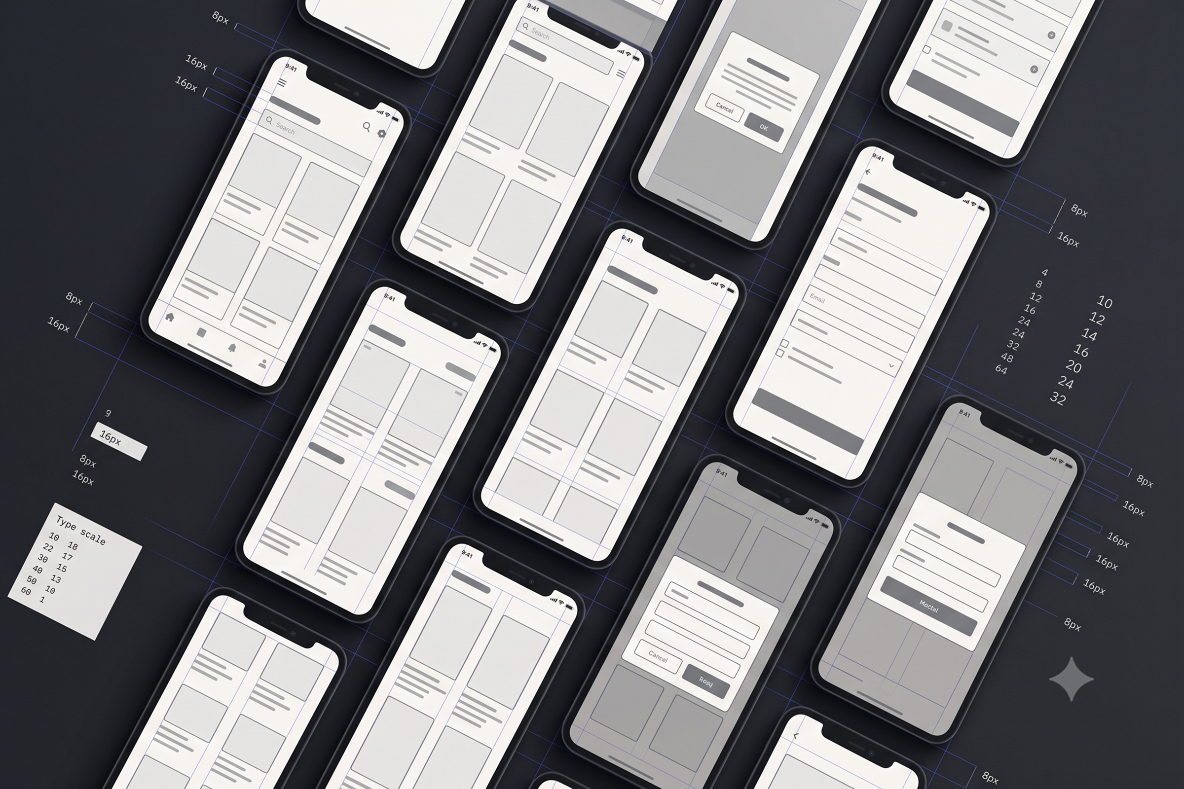
Wireframes at Ackee had gradually developed their own visual language from designer to designer. That worked well while one person owned a project, but became problematic whenever work changed hands — continuing someone else's wireframes often meant first adapting to their individual conventions rather than focusing on the product itself. I created a shared wireframe design system to establish a consistent visual and structural language across projects. It built on an existing internal project template containing basic foundations such as typography, colours, inputs, and buttons, which I simplified, visually unified, and expanded into a reusable system of nearly 50 components. An additional goal was consistent component naming and structure, making the library easier to interpret not only for designers, but also for AI-assisted tools such as Figma Make and Claude when generating early wireframe concepts.
Research & Discovery
Key Findings
The main inconsistency wasn't in individual components, but in the lack of a shared wireframing language. Each designer had developed their own conventions, making collaboration and project handovers unnecessarily difficult.
The existing internal template provided useful foundations, but wasn't extensive enough for building complete product flows. More complex patterns were still recreated independently from project to project.
A useful wireframe library needed to stay deliberately simple. Components had to be flexible enough to cover different product types without introducing visual decisions that belonged to the later UI phase.

Design Process
How I Got There
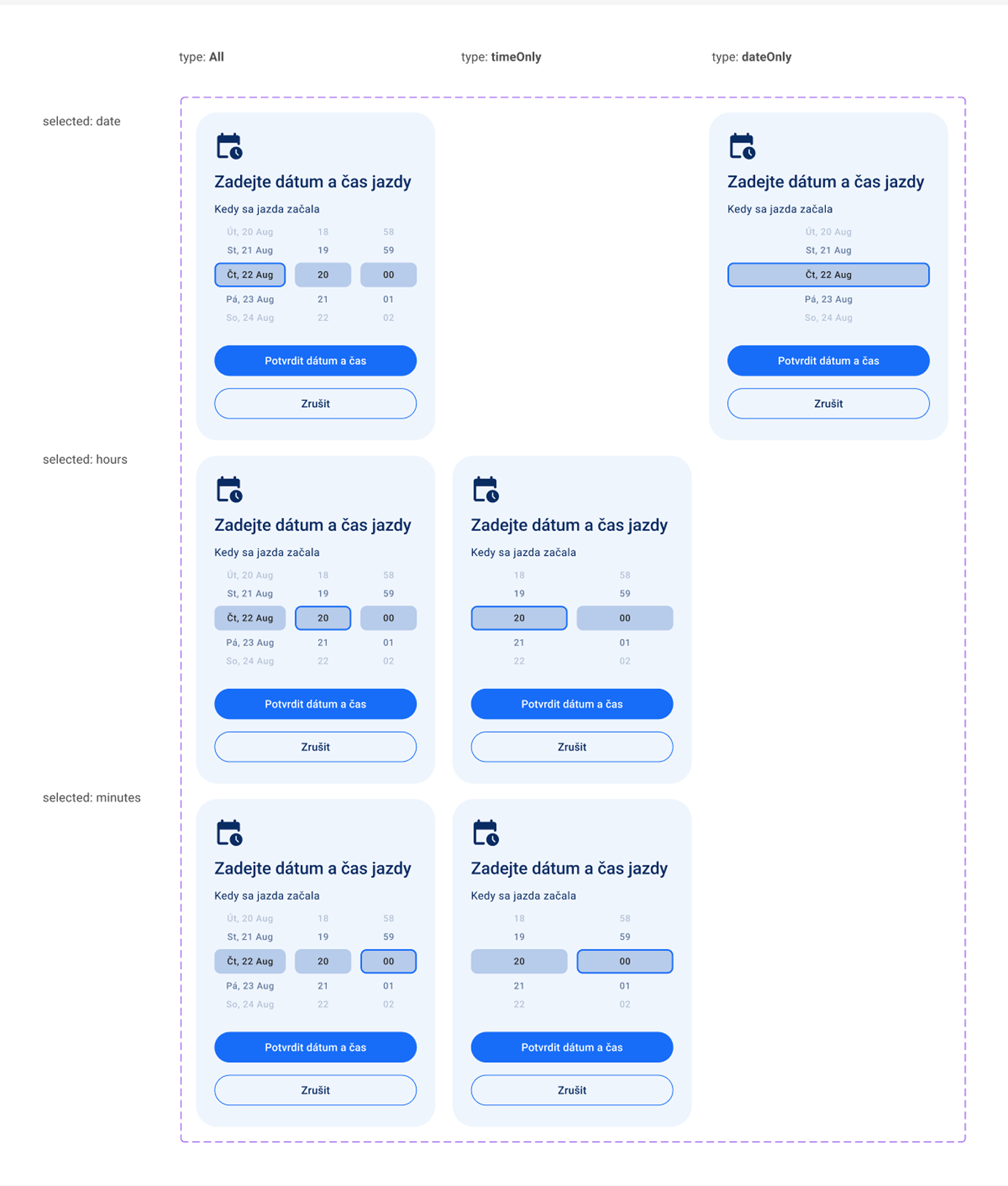
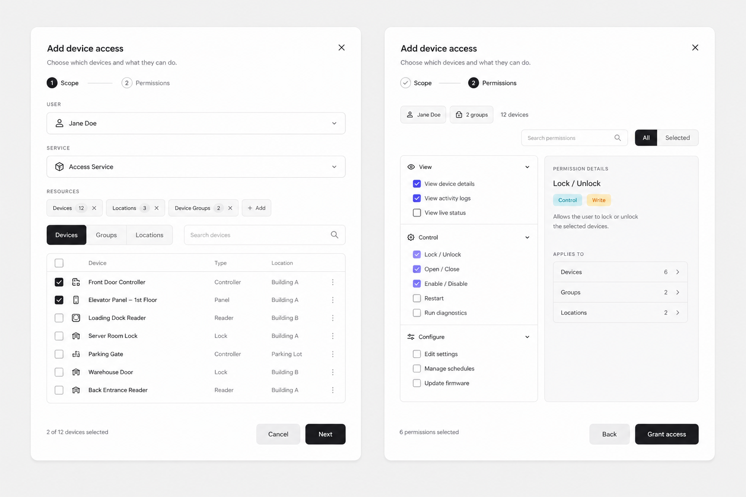
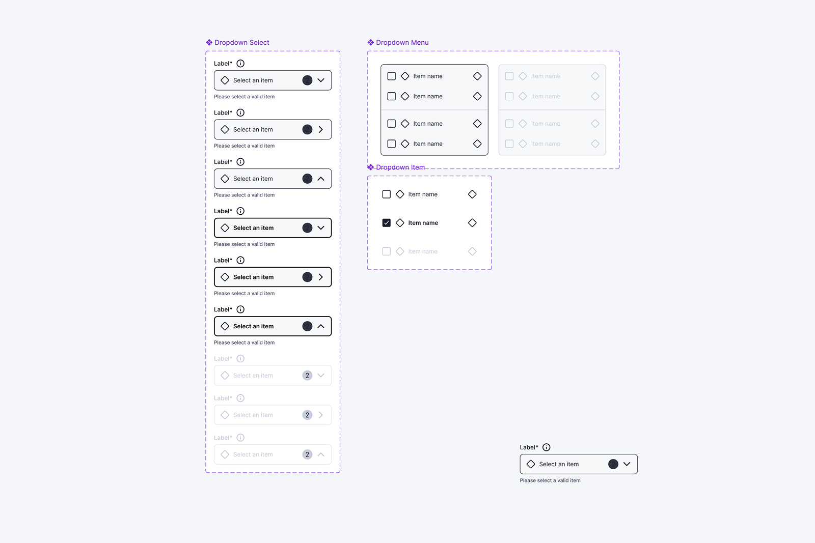
I started with the existing project template and reduced unnecessary visual variation, particularly in colour usage, to create a clearer and more neutral foundation for wireframing. From there, I expanded the library with commonly recurring interface patterns. Rather than trying to create a component for every possible situation, the system evolved through actual project use and feedback from other designers. New components were added when recurring needs appeared, while existing ones were refined to become more adaptable. The library now contains just under 50 reusable components, each with a dedicated master page showing its available states and configurations.
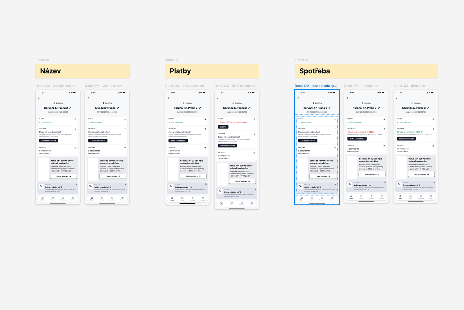
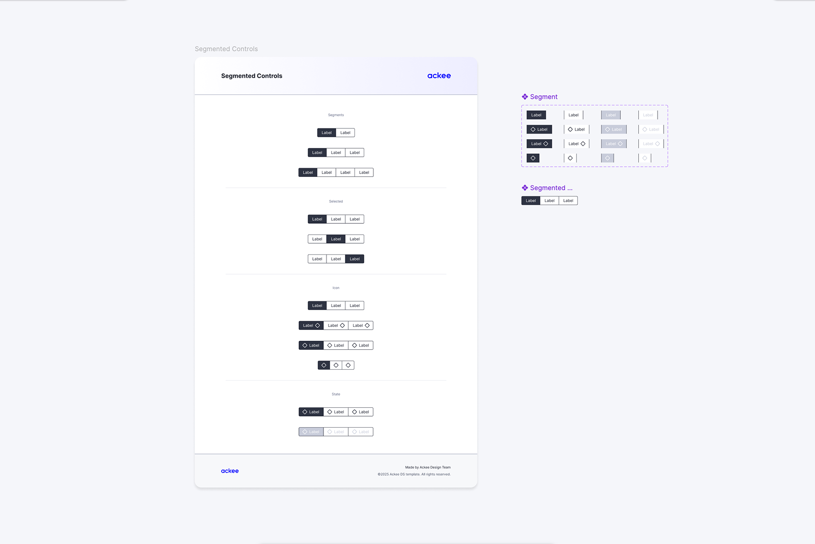
A separate overview page acts as the working canvas: designers can quickly browse instances of all available components and copy them directly into their wireframes without searching through individual component pages. The introduction of slots in Figma later allowed several previously separate components to be consolidated. Patterns such as cards and segmented controls became significantly more flexible, reducing the need for multiple narrowly defined variants and making the system easier to maintain. Consistent naming was treated as part of the system itself. Besides making files easier to navigate for designers, predictable component names and structure also make the library more suitable for AI-assisted workflows, where tools need to understand and reference existing patterns when generating initial wireframe concepts.
Final Design
The Solution
One shared wireframing language
for creating consistent low-fidelity product designs across designers and projects.
Nearly 50 reusable components
with dedicated master pages documenting their states and an overview canvas for immediate use.
Built to evolve with both designers and new tools
using adaptable component structures and consistent naming suitable for AI-assisted wireframing workflows.