
Role
Graphic Designer
Timeline
8 Months
Platform
Desktop / Mobile
Tools
 Illustrator
 Photoshop
 InDesign
Overview
The Challenge
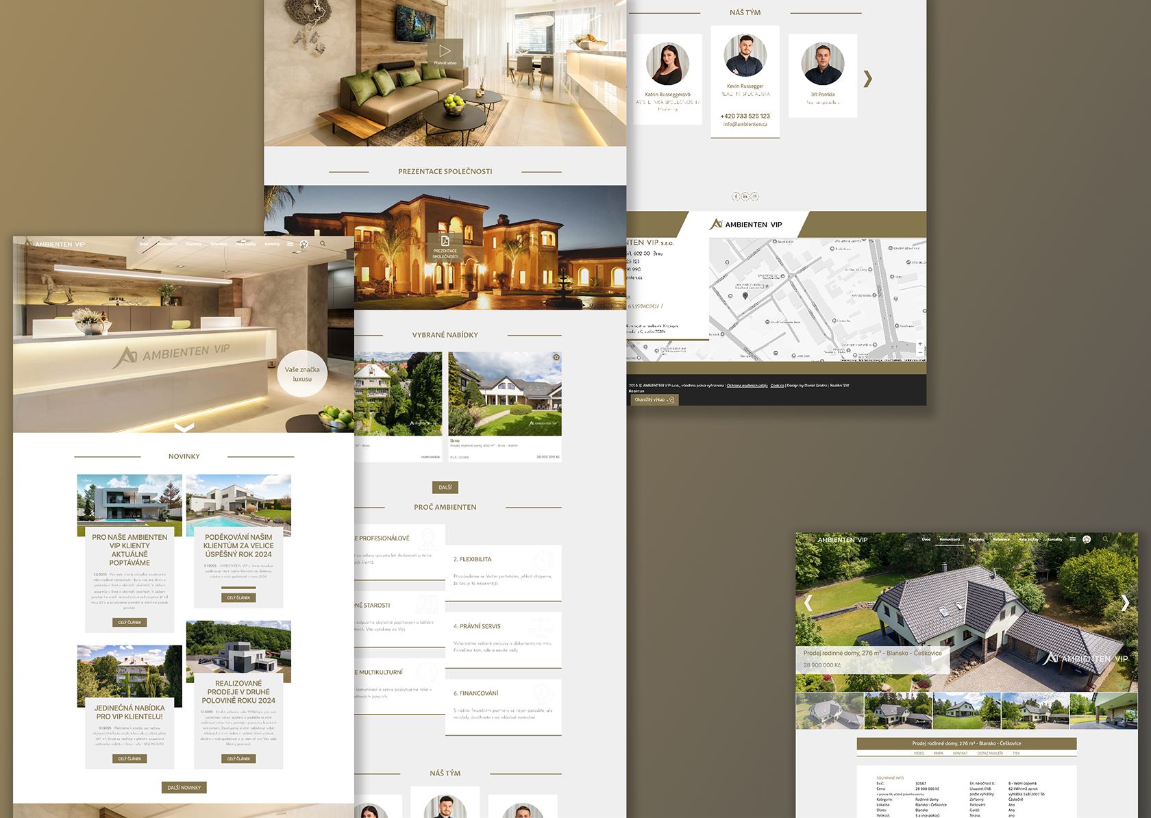
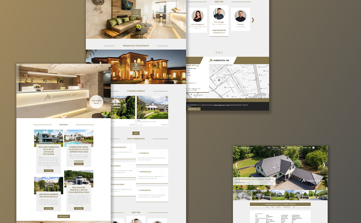
Ambienten VIP is a real-estate company specialising in luxury, high-value properties. I led the rebrand and designed the new website end-to-end, along with the full suite of brand materials — magazine advertising, branded stationery, and contract document templates. Every major decision was grounded in research into who actually buys these properties and how they browse — which reshaped some of the usual design defaults.

Research & Discovery
Key Findings
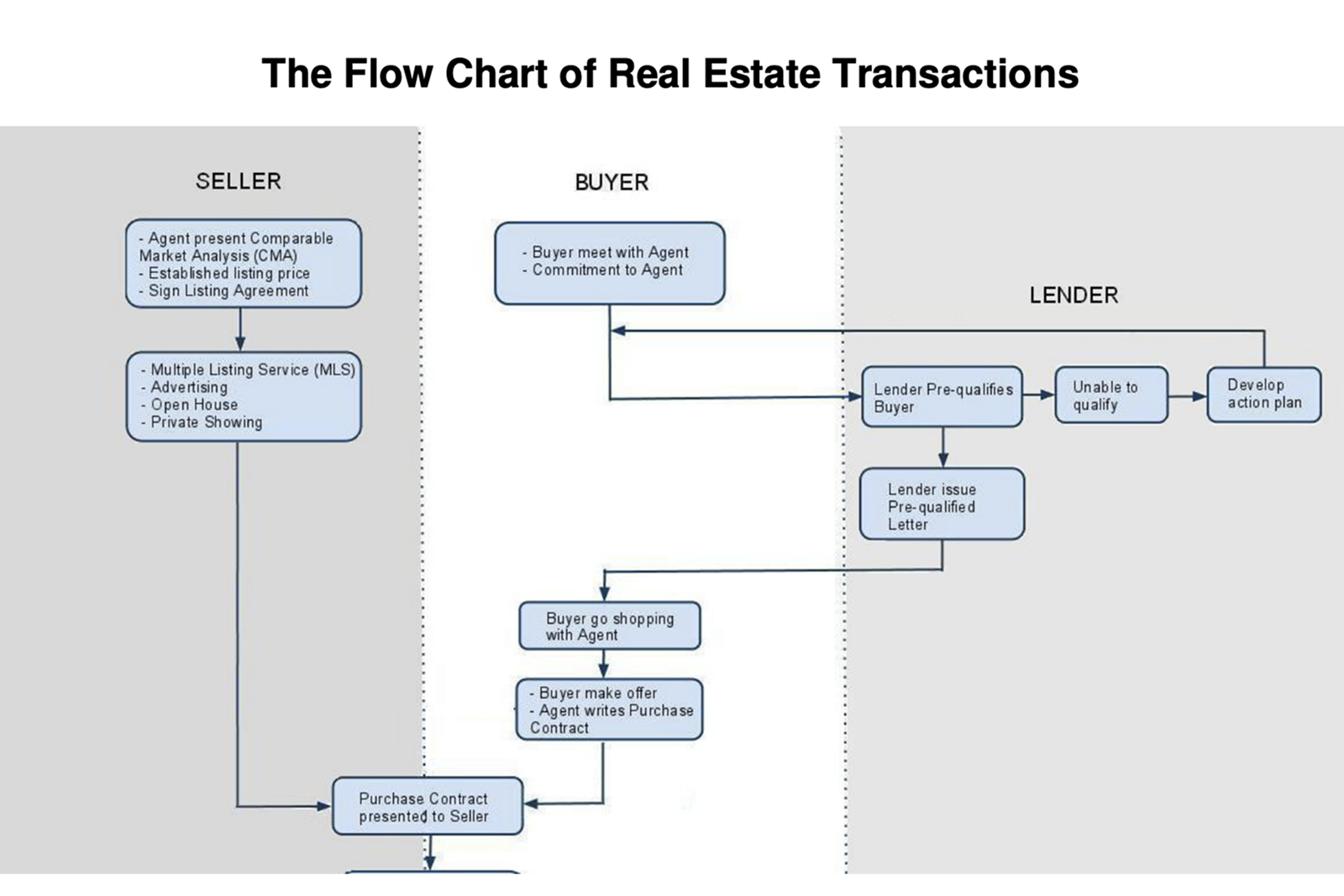
Buying a house is a desktop activity — the overwhelming majority browsed listings on a laptop or desktop PC, so I deliberately abandoned the mobile-first default for this product
Mobile's role was communication, not browsing — calls and emails, which happened outside the web environment entirely
For this audience, restraint reads as trust — conservative typography, calm colours, and generous space signal luxury better than decoration

Design Process
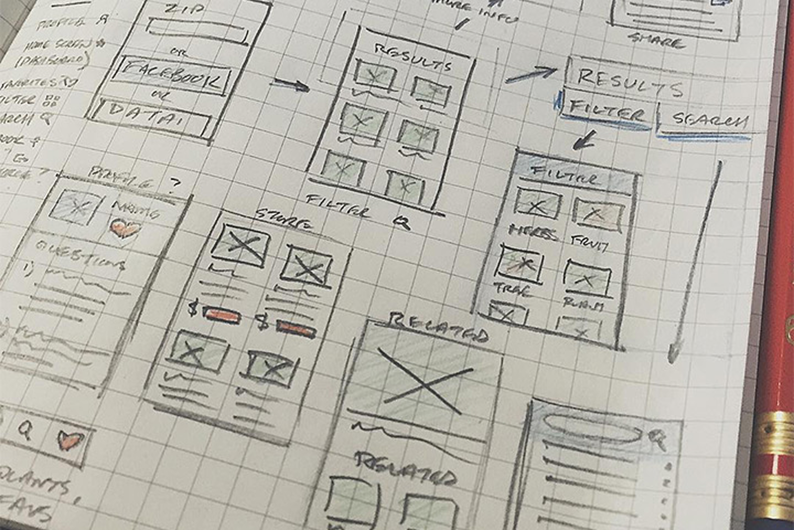
How We Got There
The rebrand stayed deliberately conservative: clean typography, a restrained palette, and generous whitespace — chosen to signal professionalism, clarity, and trust, the qualities a buyer wants when the purchase runs into millions. The logo itself is a reminder that design doesn't keep office hours: the idea arrived mid-conversation on a drive to the train station, nowhere near a screen. Some ideas just need distance and patience. The finished system extended into magazine advertising, branded stationery, and contract document templates, so every client touchpoint felt like one company.
The website was designed desktop-first — a deliberate, research-backed inversion of the usual mobile-first default. And the role stretched wherever the brand needed it: editing and occasionally shooting property photography, contracting a drone operator for exteriors, proposing an internal app for sketching floorplans on site, and collaborating with the external development team through the build — down to 404 pages, error states, and element edge cases.
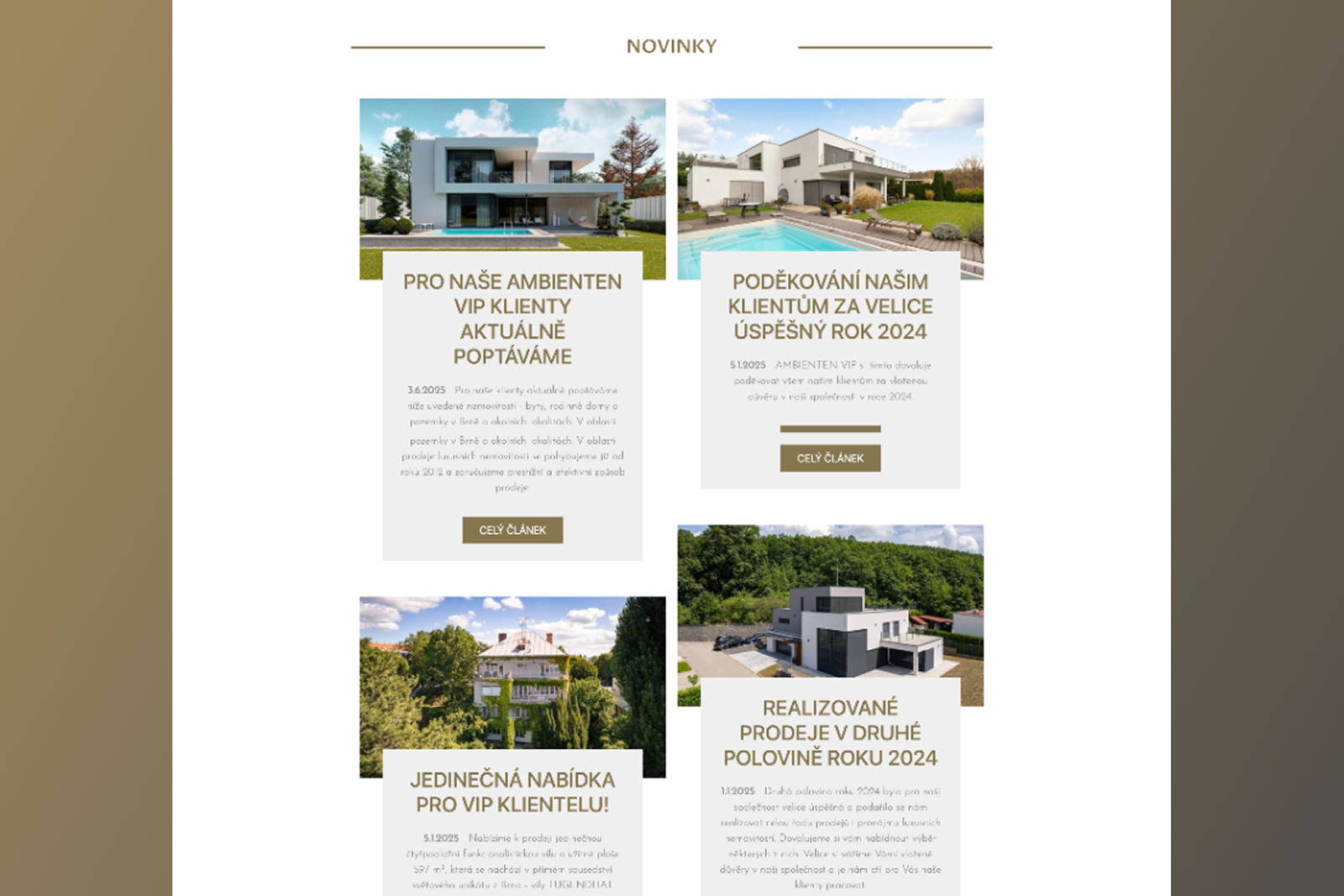
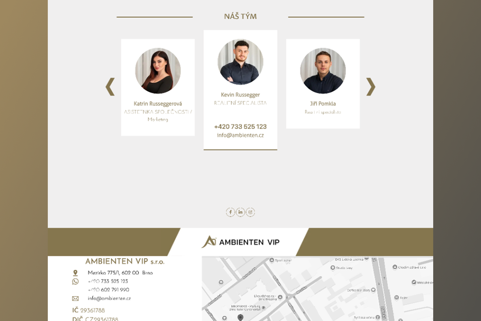
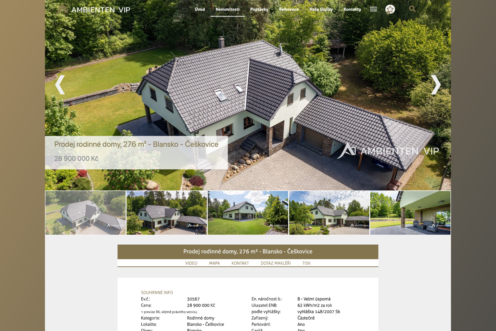
Final Design
The Solution
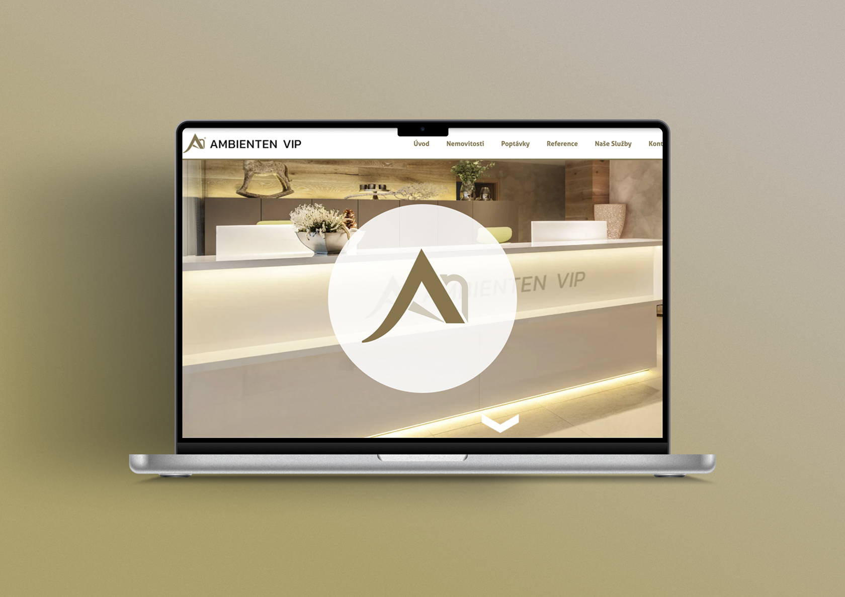
Complete rebrand and visual identity, applied across web, magazine print, stationery, and contract documents
Full website design
desktop-first by research — supported through external development, including error and edge states
End-to-end property presentation
photo editing, occasional shoots, and contracted drone photography