
Role
UX/UI Designer
Timeline
3 Months
Platform
Desktop / Mobile
Tools
 Figma
Figma Maze
Maze Miro
MiroOverview
The Challenge
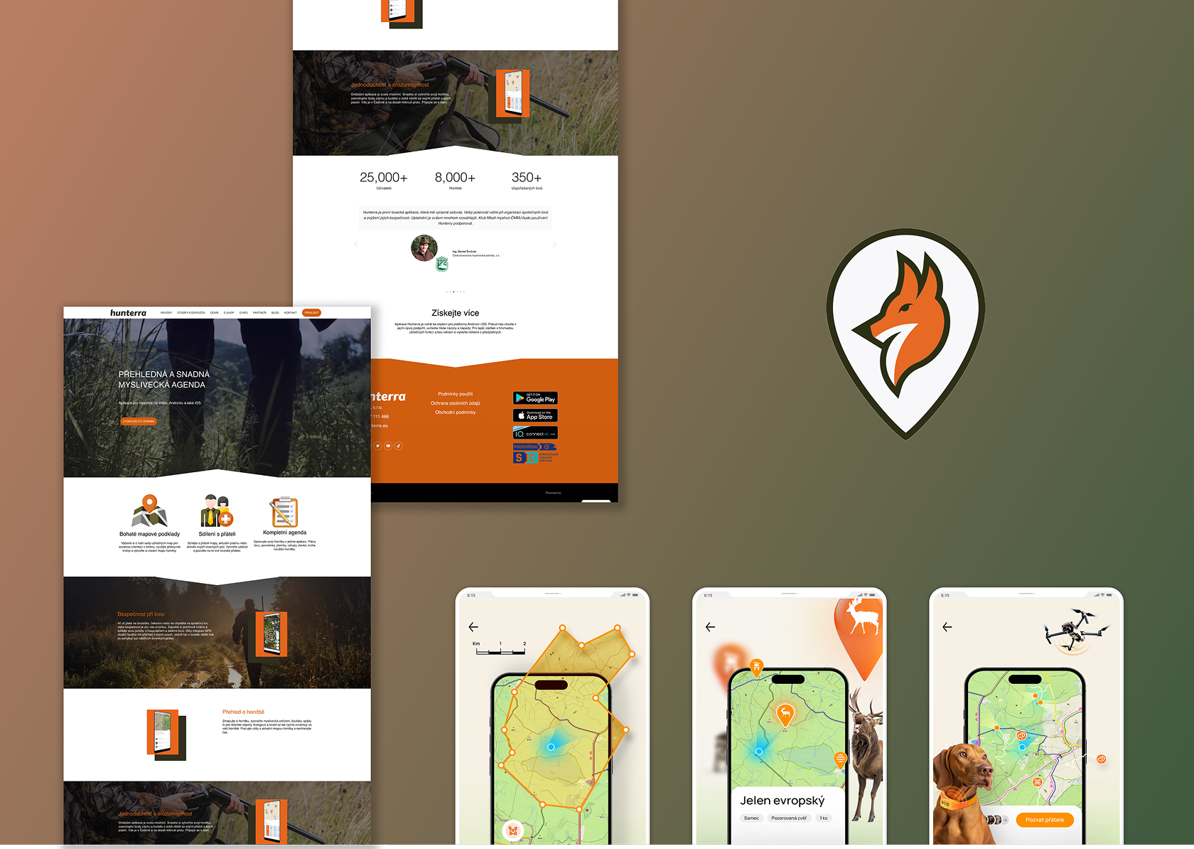
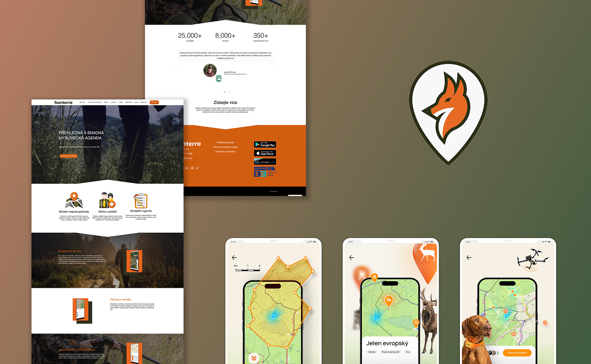
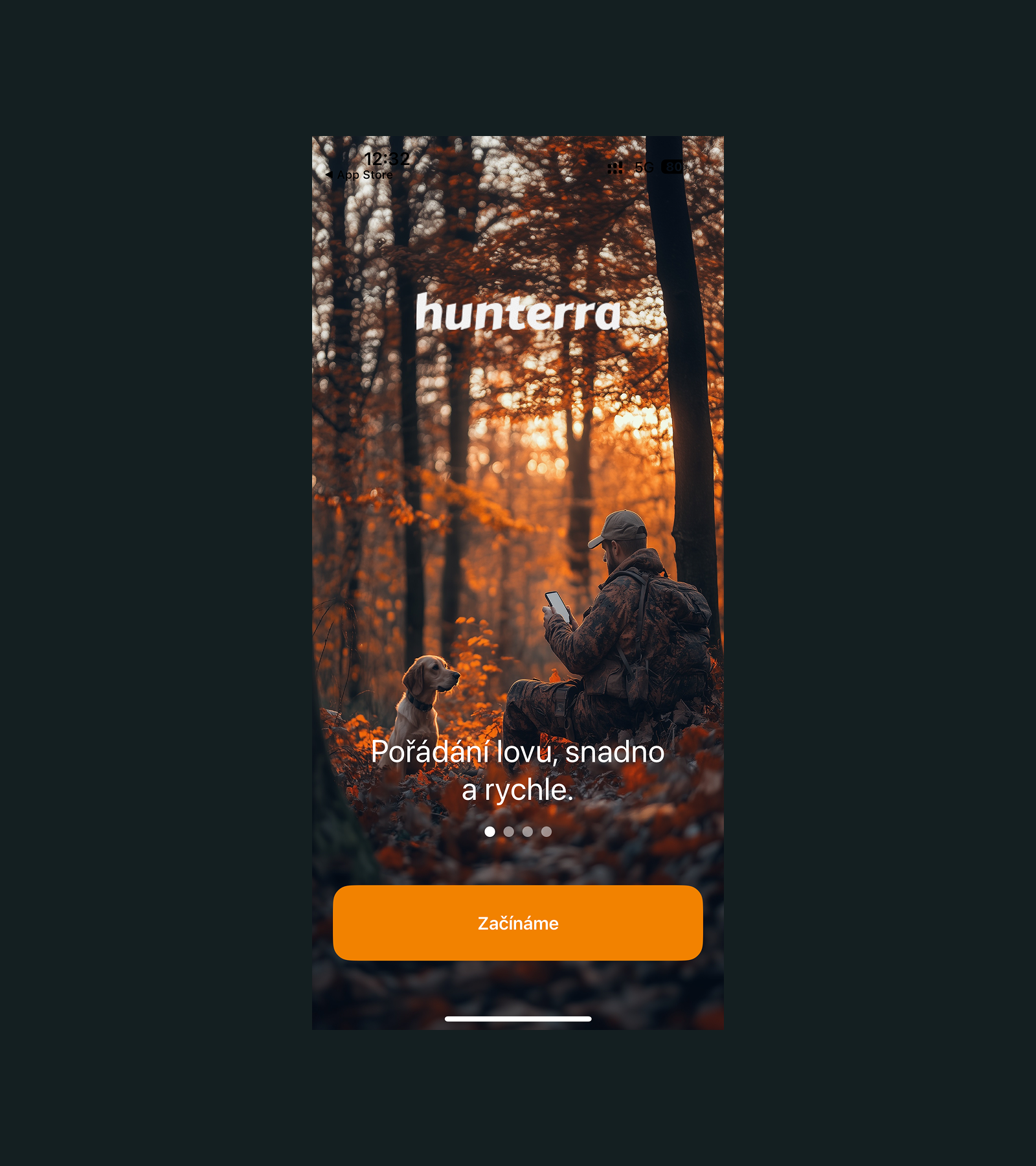
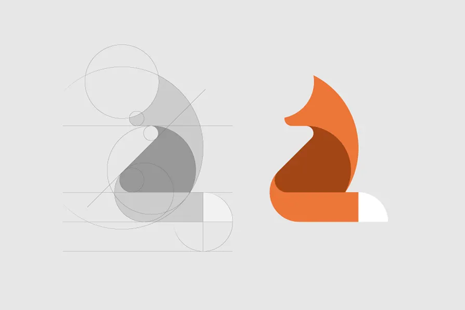
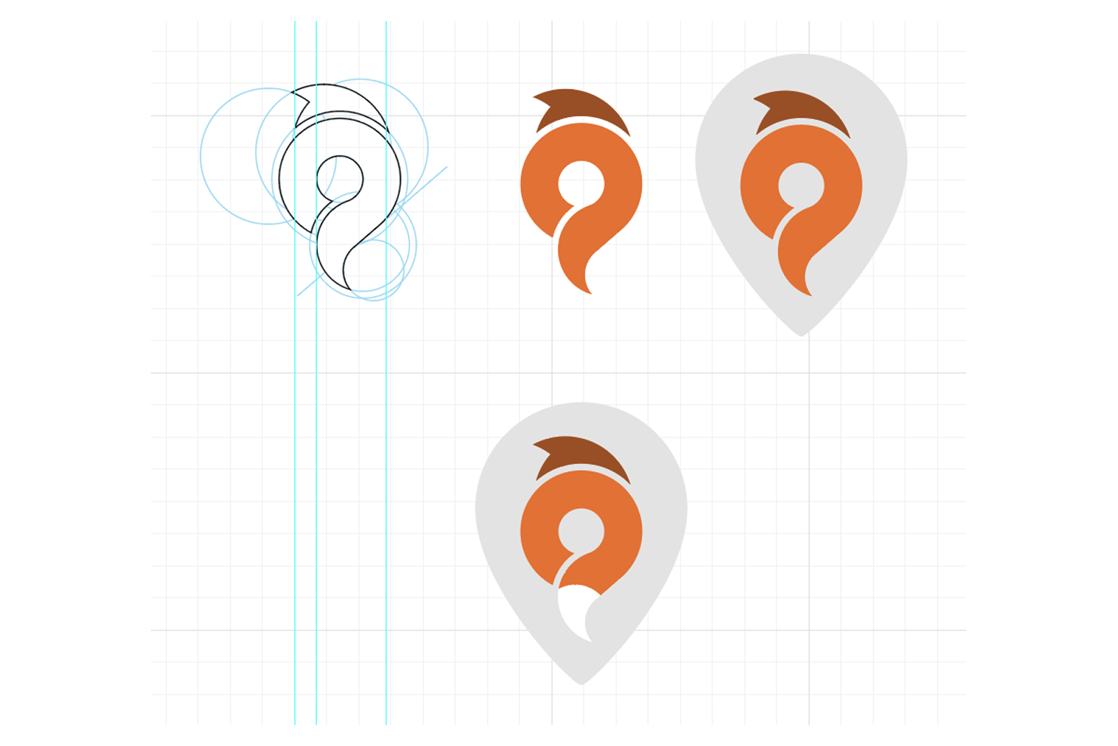
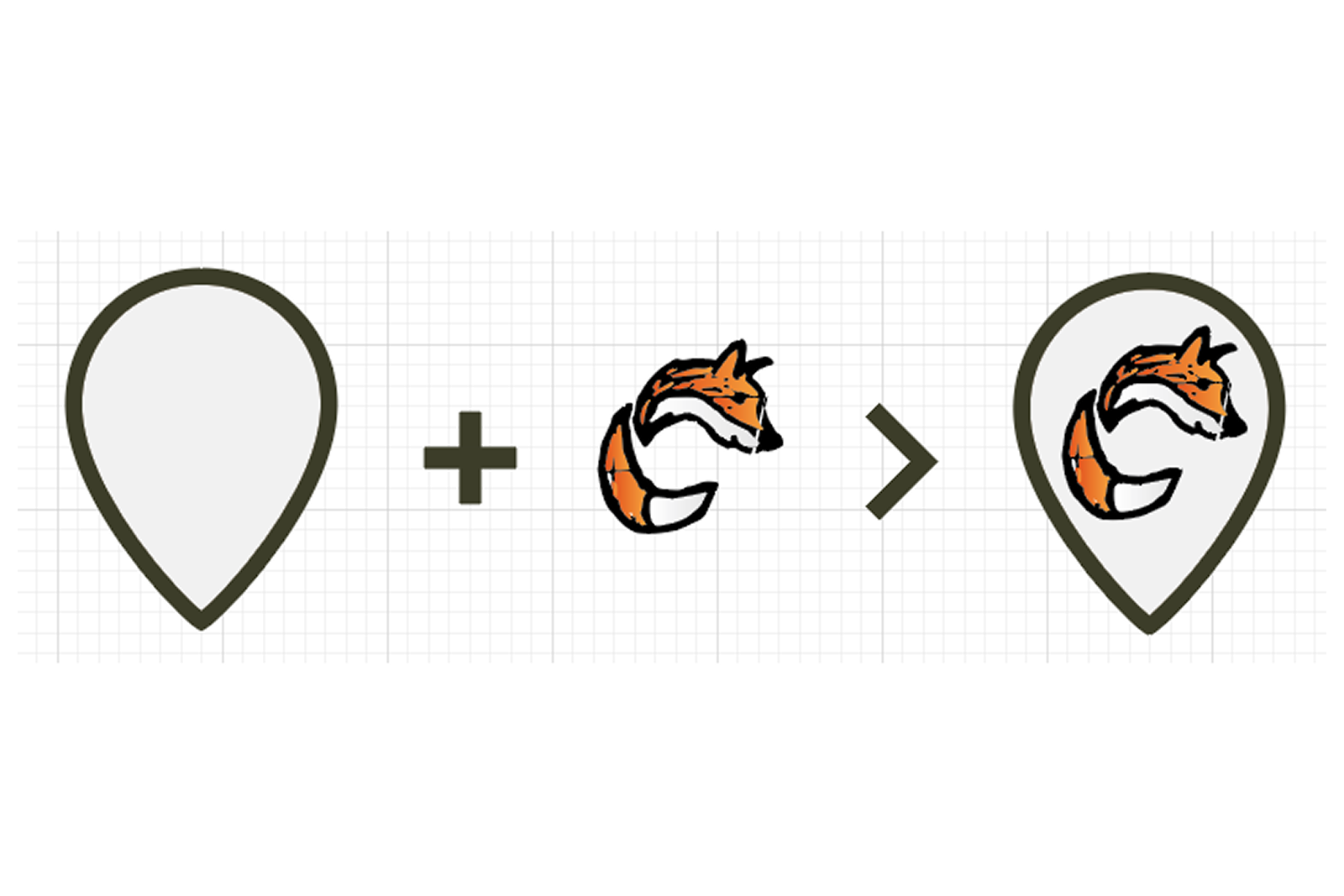
Hunterra is a digital companion for organised hunting — an iOS app and website that help hunting parties plan and run group hunts for pheasant, deer, and other forest game. I designed the product end-to-end: the planning flows for setting up a hunt and inviting participants, and the live map experience where organisers define the hunt perimeter and track the positions of hunters and game in real time. The engagement also covered the brand itself — a fox logotype (the client's one firm request), colour palette, and a brand manual carried through the app, the website, and beyond.
Research & Discovery
Key Findings
Organisers and participants need different views — one plans and controls, the other mostly needs a clear map and a schedule
The map is the product — perimeter, positions, and movement have to be legible at a glance, outdoors, in motion
Trust depends on accuracy — showing a stale or uncertain position is worse than showing none at all


Design Process
How We Got There
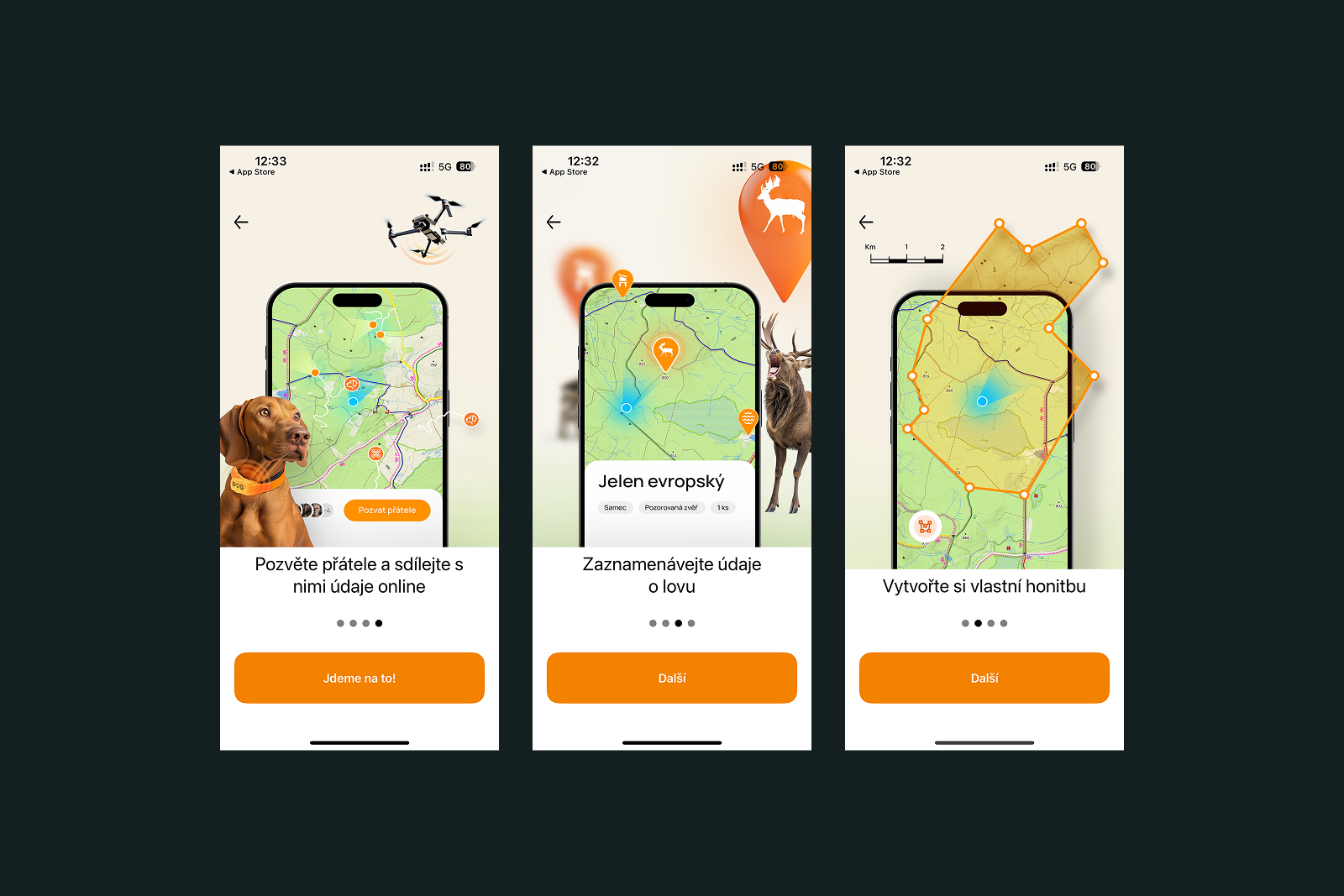
The organisation flow was designed around how hunts actually come together: an organiser creates the event, defines the territory and schedule, assigns roles, and invites the party. Everything a participant needs — meeting point, boundary, rules, timing — lives in one shared place instead of a phone chain and a paper map. The website mirrors the same structure for planning at a desk.
The field experience centres on a full-screen map: the hunt perimeter drawn by the organiser, live positions of participants, and the recorded movement of game. I designed for glanceability — high-contrast markers, generous touch targets, and an unmistakable visual distinction between people, game, and boundaries — so the app stays usable in gloves, glare, and low light.
Final Design
The Solution
Complete UX/UI design for the iOS app and website
from information architecture to high-fidelity screens
A map-first interaction model covering perimeter setup, live participant tracking, and game movement
Planning flows that replace phone chains and paper maps with a single shared source of truth