
Role
Solo Designer
Timeline
6 Months
Platform
Desktop / Mobile
Tools
 Figma
Figma Adobe CC
 Claude
Overview
The Challenge
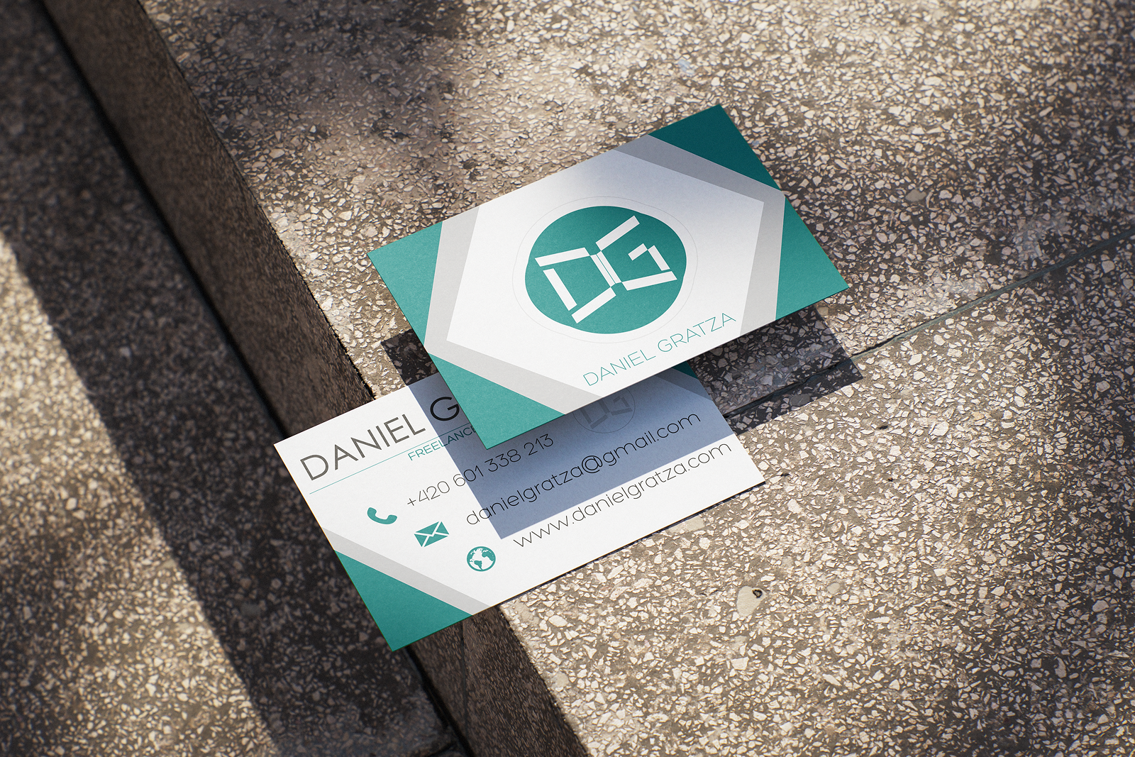
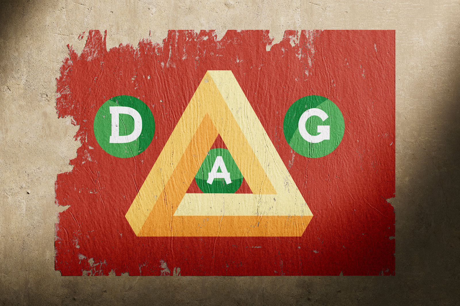
Building my personal brand was a long-term, iterative process shaped by both self-exploration and a growing design maturity. It started as an attempt to unify how I presented myself across different platforms — portfolio, CV, social media, and client materials — but evolved into a deeper reflection of my values as a designer.
Research & Discovery
Key Findings
Most designer portfolios over-index on work quantity — a curated, depth-first approach stands out more
Typography is the most powerful differentiator in personal brand identity for UX designers
The rarest combination in the market was a clean, modern aesthetic paired with genuine warmth and editorial flair

Design Process
How We Got There
The visual identity wasn't built in one go — it took several iterations, influenced by skill growth, feedback, and shifting inspiration. The final system landed on a pairing of Big Caslon CC (editorial, confident, slightly unconventional) with Futura PT (rational, structured, clean). This tension between classical and modernist became the brand's defining character.
From the typeface pairing, I derived a full system: grid structure, spacing scale, colour palette, iconography principles, and motion language. The portfolio site itself became the primary testbed — every design decision had to survive in the real, interactive environment before making it into the system documentation.
Final Design
The Solution
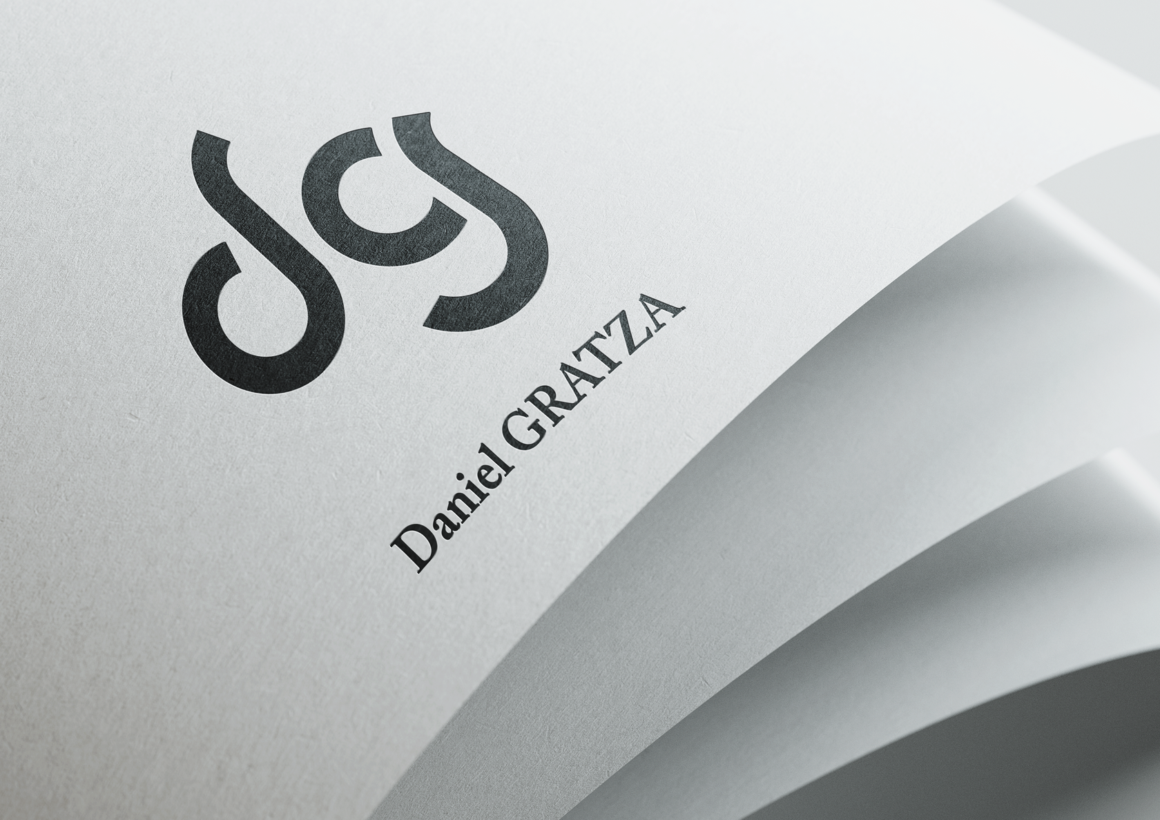
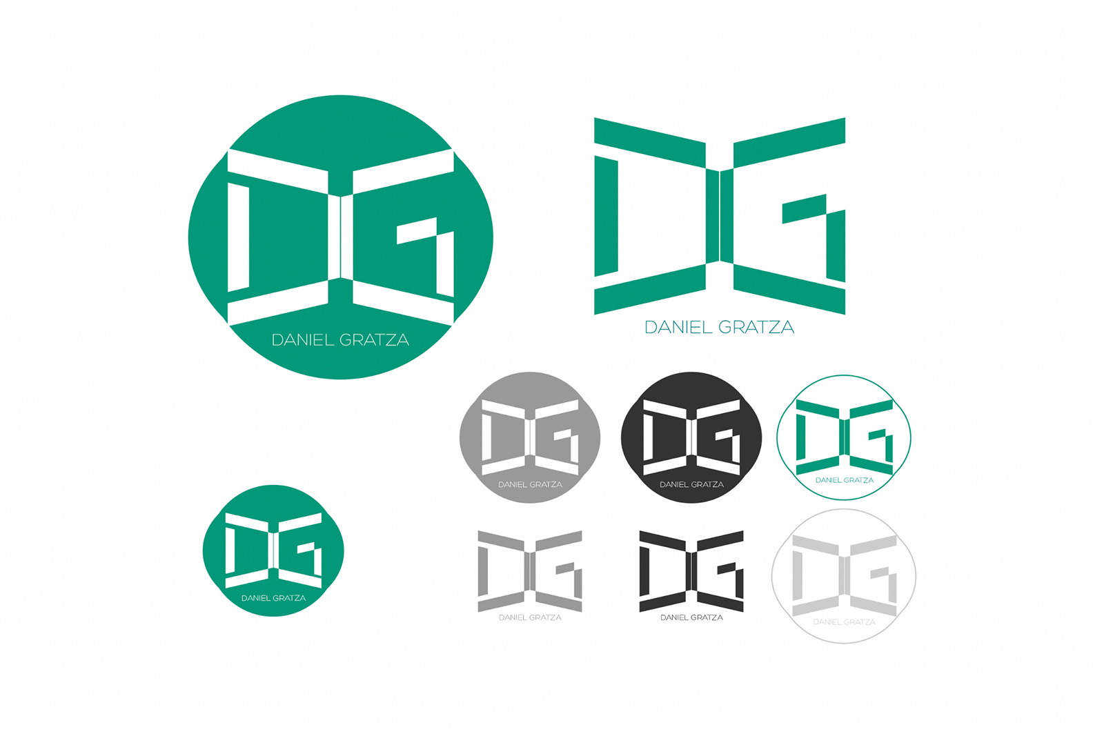
Complete brand identity system
logomark, typeface pairing, colour palette, grid, and motion principles
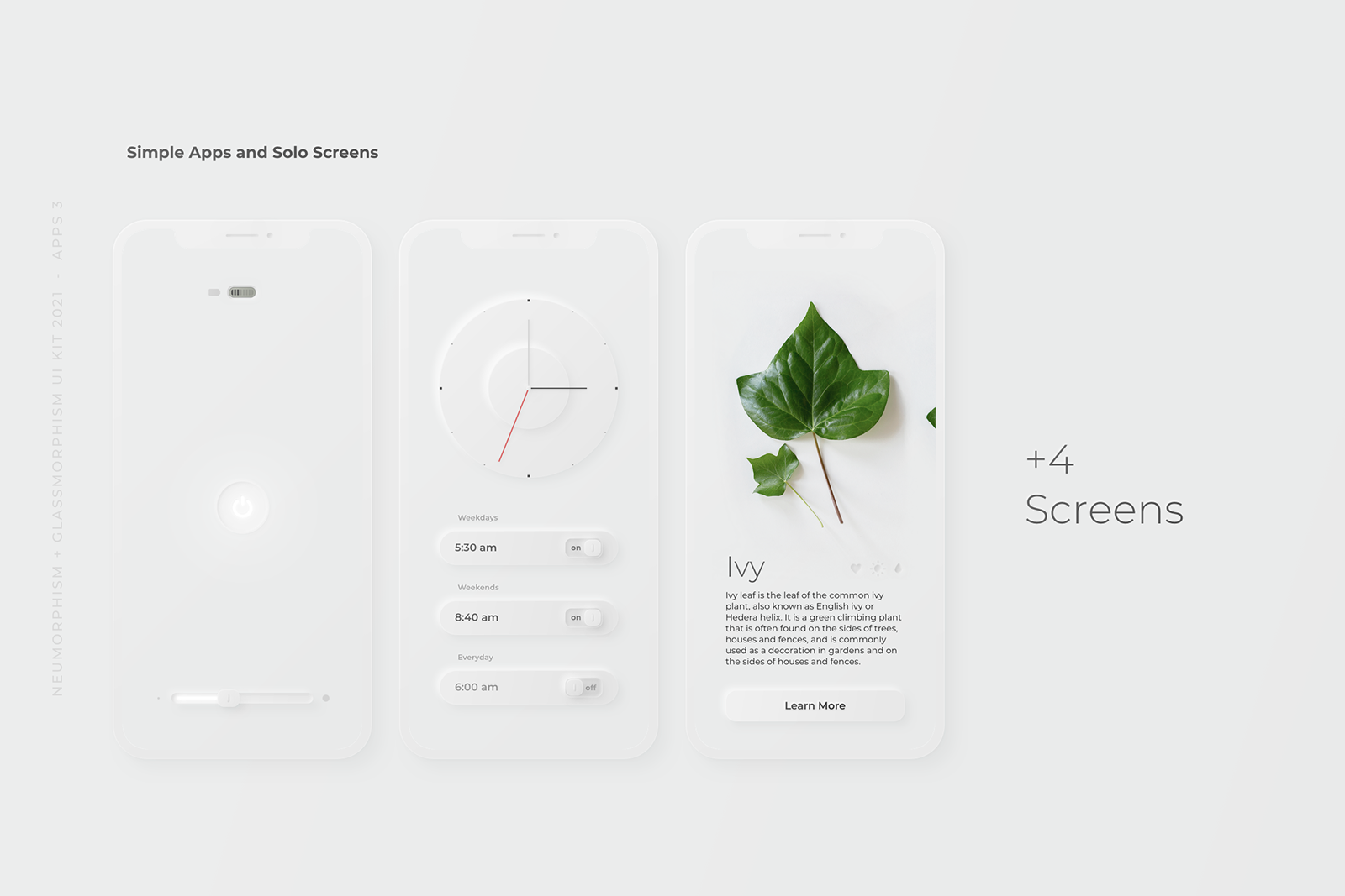
Live portfolio website built in Next.js with full dark mode and responsive layout
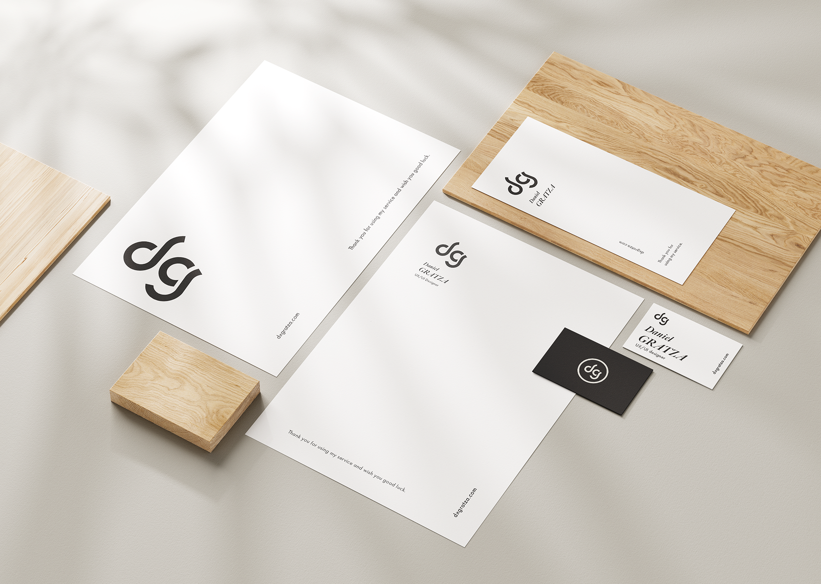
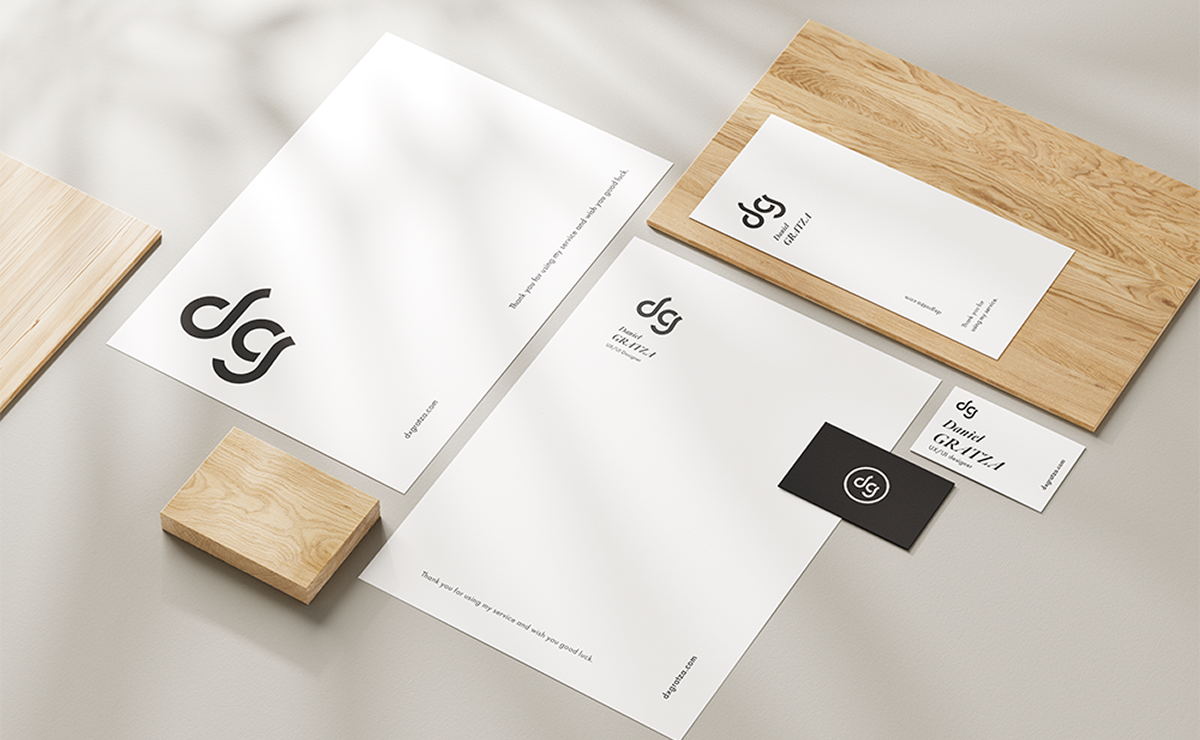
CV, cover letter, and client proposal templates derived from the system