
Role
UX / UI Designer
Timeline
Two Short Exercises
Platform
PC · Controller-aware
Tools
 Figma
Figma Illustrator
 Photoshop
Overview
The Challenge
Across two time-boxed hiring exercises for Bohemia Interactive, I explored three connected Arma 4 design tasks: an in-game inventory, a five-level medal system, and the multiplayer journey from mission briefing to deployment. The surfaces are different, but the underlying problem is the same: make dense tactical information understandable without making the simulation feel generic or simplified. I structured the case study around a shared UX process rather than presenting each task as an isolated project. Research, information modelling, low-fidelity structure, system design, and visual refinement progressed continuously — and sometimes in parallel — across the inventory, medals, and deployment flow.
Research & Discovery
Key Findings
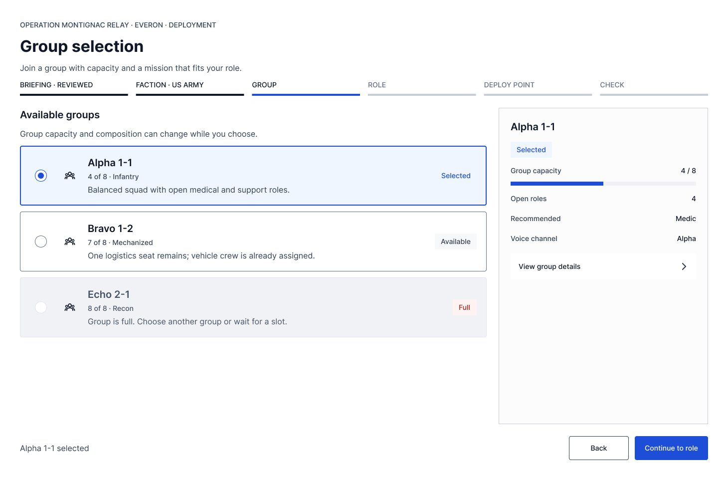
Deployment task — group selection must show capacity, composition, open roles, and changing availability without becoming a spreadsheet
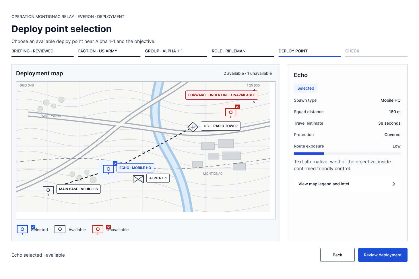
Deployment task — when the player chooses a spawn position, the map should become the primary decision surface
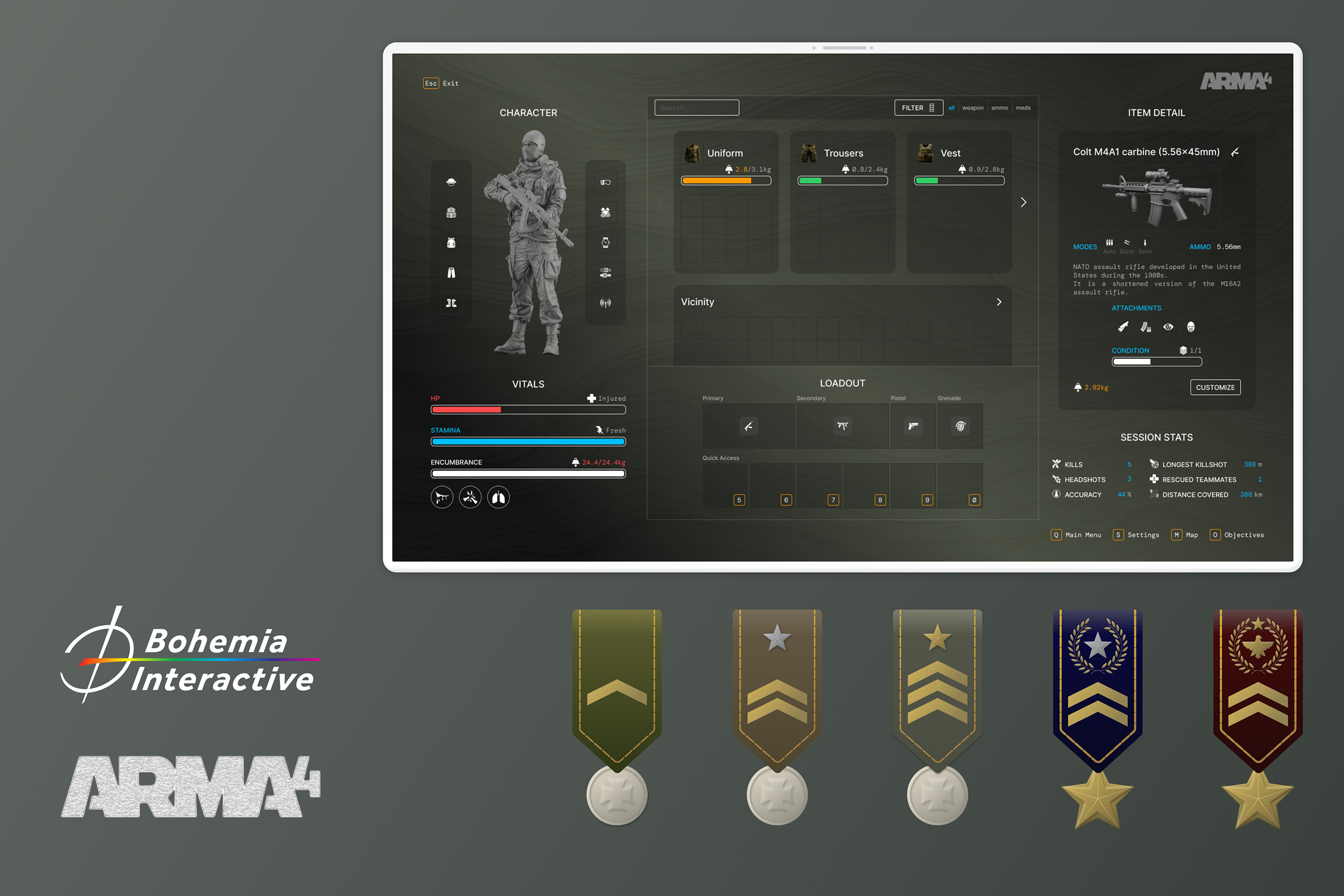
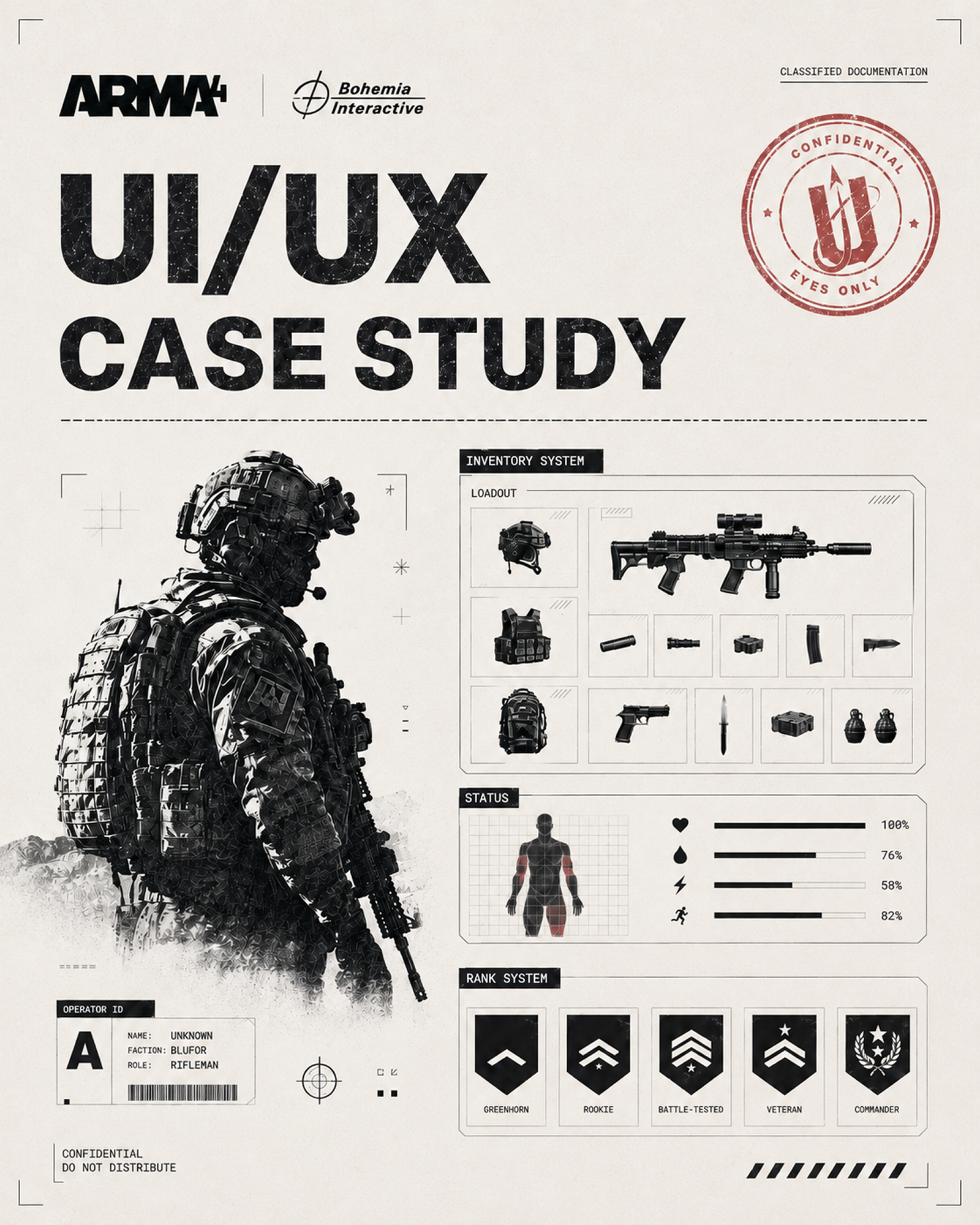
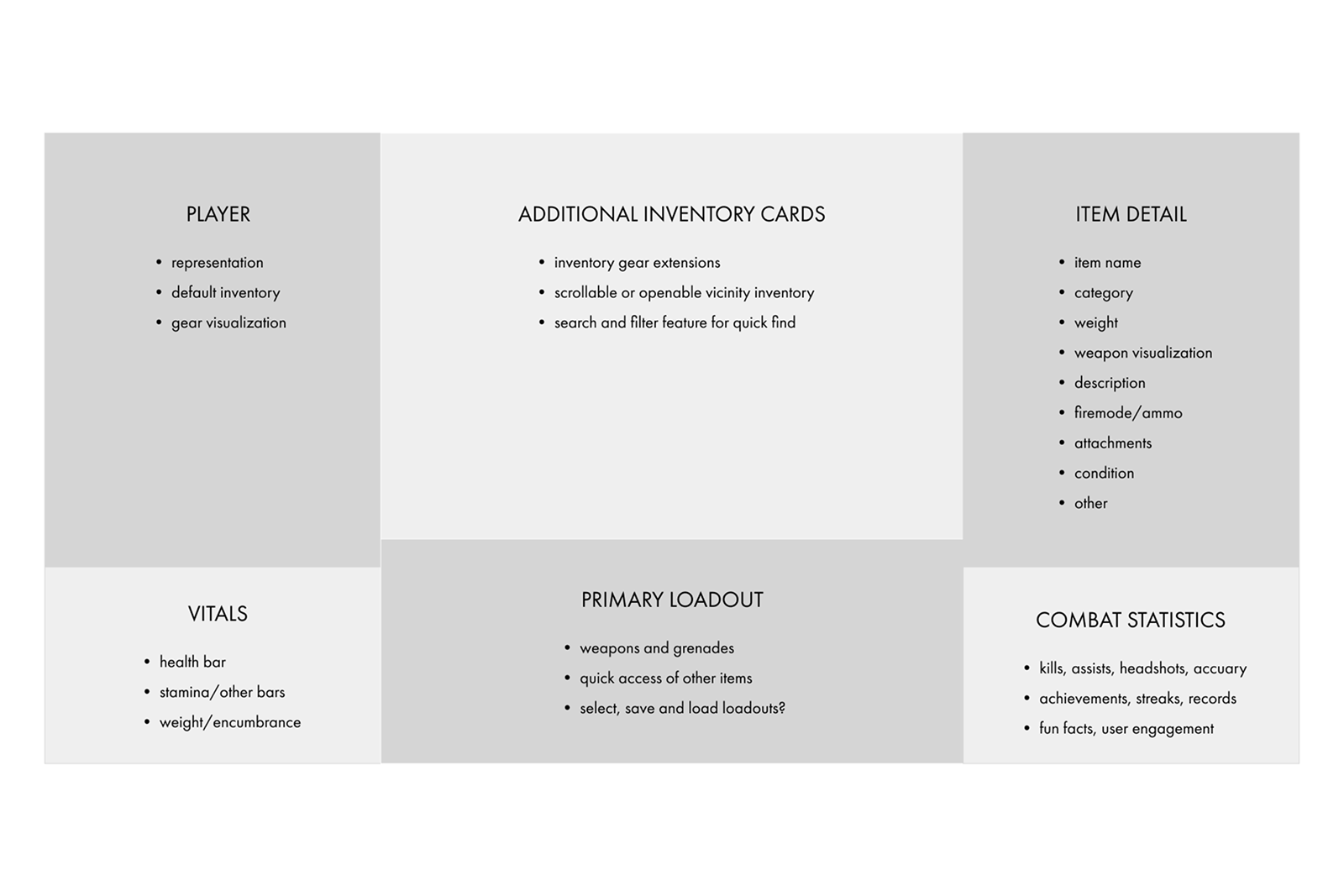
Inventory task — stable zoning makes character status, carried gear, loadout, nearby items, and item detail spatially predictable
Design Process
Three tasks, one UX process
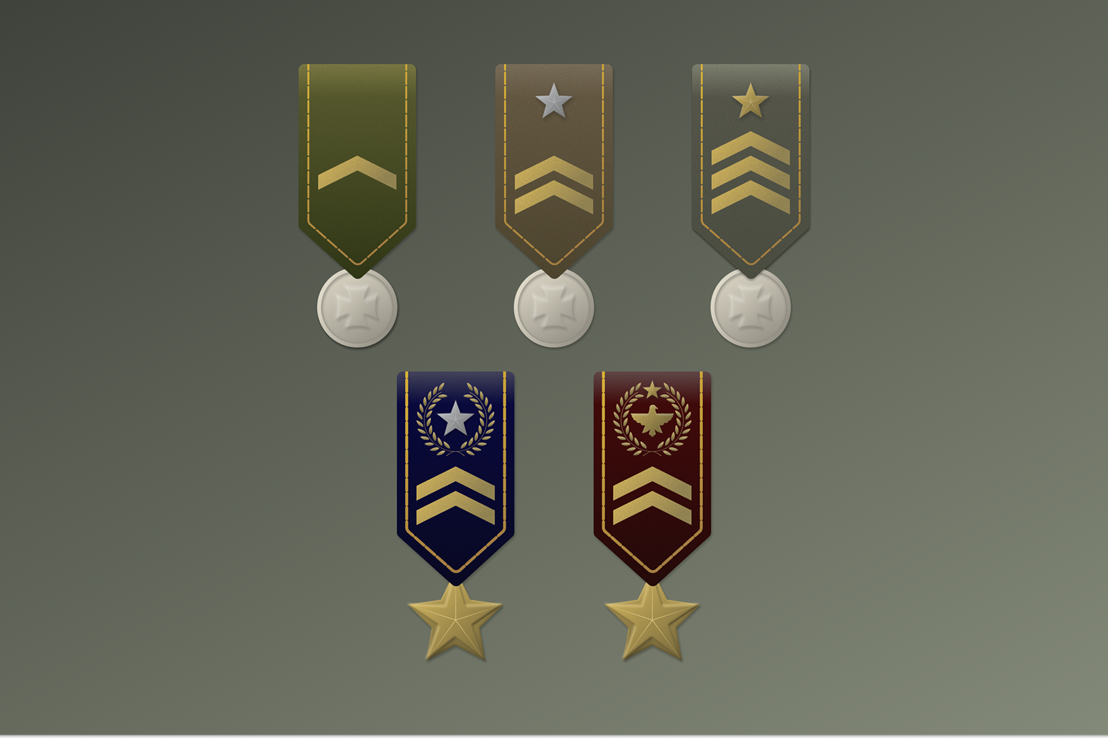
I moved the three tasks through comparable phases, sometimes in parallel. For the deployment task, I mapped the decision dependencies first, then wireframed group selection and deploy-point selection to test hierarchy, live availability, and consequence. For the inventory task, I translated the requirements into clear screen zones for character status, carried containers, vicinity, loadout, item detail, and session context. For the medal task, I defined a shared construction and five readable levels before exploring surface detail.
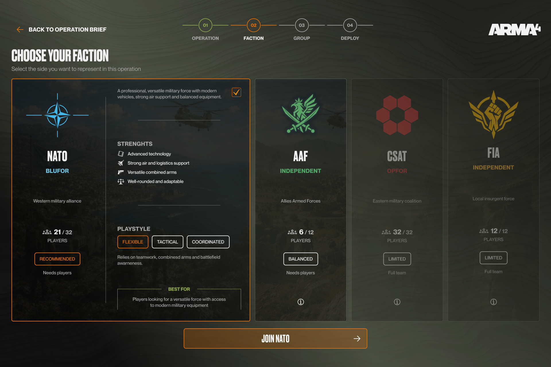
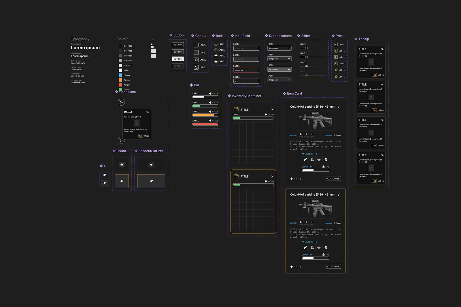
Once the structures were stable, each task moved toward the fidelity it needed. The deployment task developed into a polished faction-selection screen using progressive disclosure and explainable states. The inventory task became a reusable Figma system of typography, spacing, controls, tooltips, filters, capacity bars, and input prompts. The medal task applied chevrons, stars, wreaths, colour, and material to the shared base, increasing prestige while keeping the family visually consistent.
Final Design
The Solution
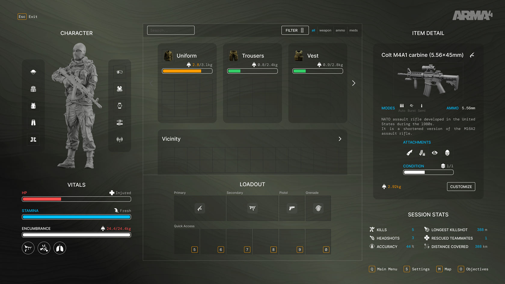
Inventory system
A modular screen model that connects player status, carried containers, nearby items, equipped loadout, item detail, and session context.
Medal progression
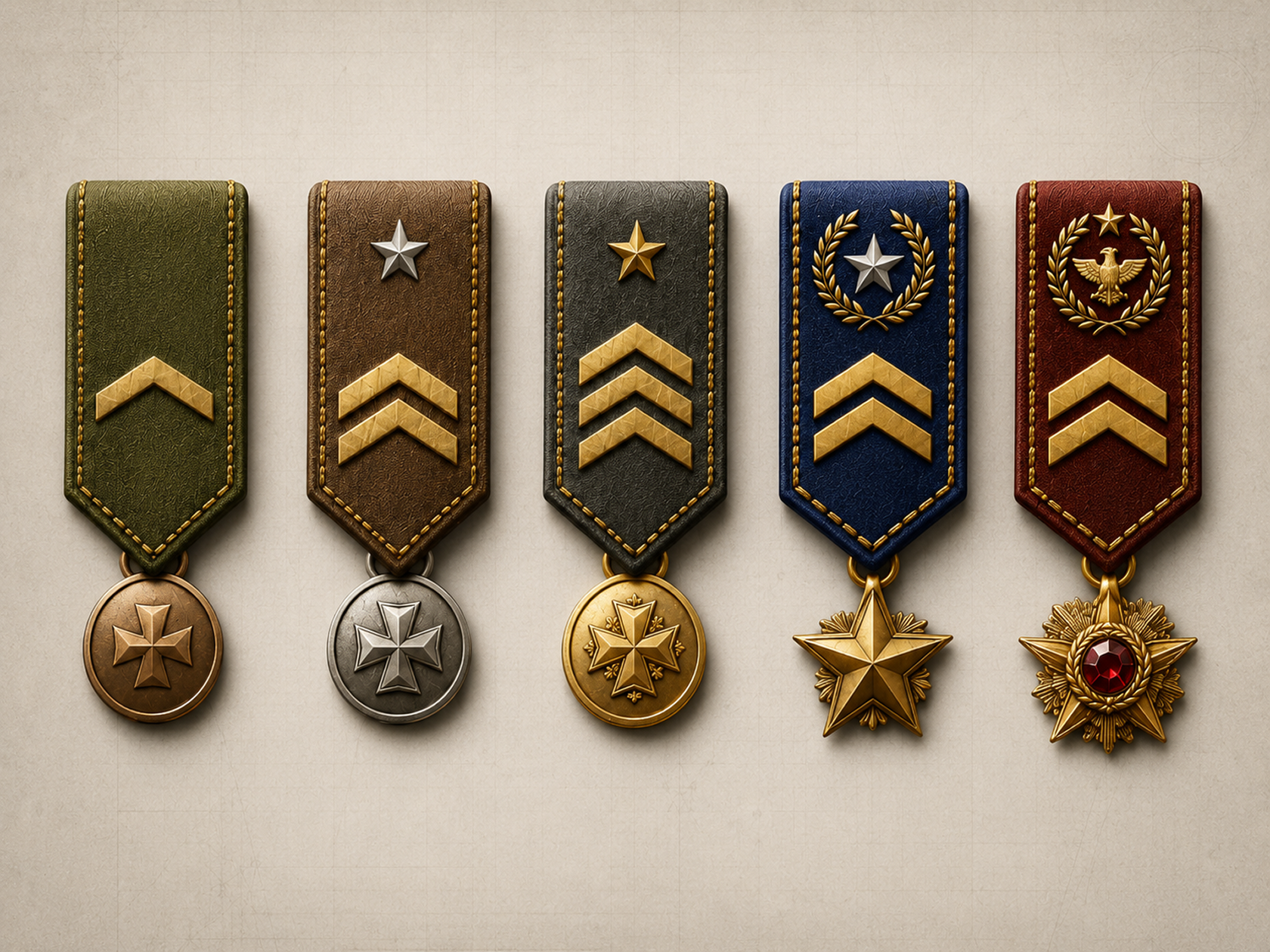
Five recognisable levels built from a shared construction, with increasing distinction through silhouette, symbols, colour, and material.
Deployment flow
A complete journey from mission briefing to spawn, supported by group and deploy-point wireframes and a polished faction-selection concept.